Fatih_my project

Categories
Project IT

Infographic

Infographic

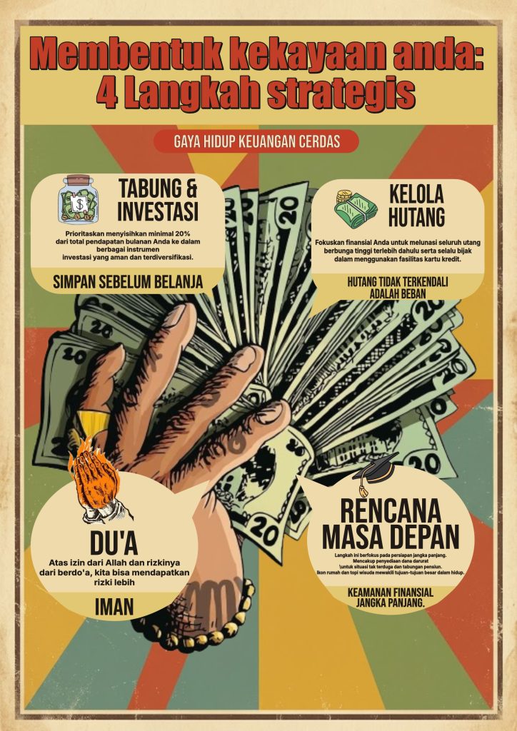
This infographic artwork was created entirely through digital illustration, combining a bold retro-poster aesthetic with structured infographic layout to communicate financial literacy content. The headline “Membentuk Kekayaan Anda: 4 Langkah Strategis” is presented in a thick, hand-drawn comic-style serif font with a red fill and dark outline, giving it a strong, attention-grabbing presence against the cream header background. Supporting labels and speech-bubble callouts use a mix of bold sans-serif headers and clean body text, keeping the four content sections easy to scan while maintaining visual consistency throughout the piece.

In terms of composition, this infographic is presented in a vertical portrait format with a central hand-drawn illustration of a hand fanning out cash as the unifying visual anchor. Four speech-bubble style callout panels are arranged symmetrically around this central image — two at the top for “Tabung & Investasi” and “Kelola Hutang,” and two at the bottom for “Du’a” and “Rencana Masa Depan” — each paired with a small supporting icon (a savings jar, a stack of bills, praying hands, a graduation cap) that reinforces its message at a glance. The radiating sunburst background pattern behind the central hand adds visual energy and draws the eye inward, while the vintage paper-textured border keeps the overall composition grounded and cohesive.

The color palette leans into a warm, retro tone with mustard yellow, olive green, burnt orange, and muted teal working together against a cream backdrop, creating a nostalgic, editorial feel that still reads as approachable and friendly. The consistent use of cream-colored speech bubbles across all four sections ties the composition together, while the red accent badge “Gaya Hidup Keuangan Cerdas” anchors the subtitle with a clear focal contrast point beneath the main title.

Technically, the difficulty level for producing an infographic like this falls into the intermediate-to-advanced range, as it requires careful balancing of illustrative elements, speech-bubble shape construction, and text hierarchy across four distinct information sections. Techniques such as custom shape building for the speech bubbles, integrating detailed hand-drawn illustrations, layering icons with text blocks, and maintaining color harmony across a busy retro background all come into play. This piece serves as a strong example of how illustration and infographic design principles can be combined to turn dense, informative content into a visually engaging and easily digestible piece of communication design.
Categories
Project IT

Poster

Poster

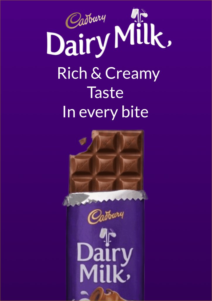
This poster artwork was created entirely through digital design from affinity, combining product photography elements with graphic design elements in one cohesive promotional composition. The “DAIRY MILK” typography is presented in bold serif letters with a golden metallic gradient effect, creating a luxurious, premium impression that aligns with Cadbury’s brand identity. The brand logo is placed in the upper right corner using a classic script style in gold, reinforcing the elegant feel while maintaining a clear visual hierarchy between the brand element, title, and the “Rich & Creamy” tagline.

In terms of composition, this poster is presented in a vertical portrait format with the chocolate product as the main focal point, positioned at a dynamic diagonal angle to create a sense of movement and energy. The signature purple Cadbury wrapper is paired with a broken chocolate bar exposed at the top, revealing the texture of the chocolate squares in detail as both a visual draw and a clear product statement. A caramel-brown splash element is placed as a background behind the product, adding depth and dimension without distracting from the main focus on the packaging.

The color palette is built on strong contrast between the dark brown background, golden typography accents, and the signature purple of the Dairy Milk wrapper, creating a visual balance that feels warm, premium, and appetizing. The negative space surrounding the product is kept generous, giving visual breathing room while emphasizing the diagonally-placed packaging’s silhouette.

Technically, the difficulty level for producing a promotional poster like this falls into the intermediate range, as it involves precise product composition arrangement, careful adjustment of lighting and shadows to achieve a natural look, and color harmonization between the typography, logo, and decorative background elements. Basic techniques such as layer management, blending modes, and color gradient adjustments are sufficient to achieve a professional, marketing-ready promotional poster.

Categories
Project IT

Design illustration

Design Illustration

This illustration was created entirely in Affinity Designer, combining vector and pixel approaches in a single, integrated workflow. The contours of the face, hair, and body shapes were built using the Pen Tool to produce precise, clean lines, then refined with the Node Tool so that every curve feels proportional and natural. For gradients and texture, a pixel-based approach was also employed through brushes and blending modes, allowing the bold vector elements to blend with raster touches that add depth to the final result. Reference photos were also digitally adapted as proportion guides, making the entire process a balanced fusion of technical precision and personal artistic touch.

In terms of composition, this illustration is presented in a vertical portrait format with the main subject placed as the focal point, immediately drawing the eye from first glance. The surrounding negative space is kept open, giving visual breathing room while emphasizing the silhouette without diverting focus from the main details. The color palette is arranged harmoniously with smooth gradient transitions, building a sense of volume and dimension without feeling excessive. The combination of clean flat areas and soft gradient touches creates a visual balance that makes this piece feel modern, warm, and personal.

Technically, the difficulty level of this piece is fairly easy and quite approachable for anyone just starting to explore digital illustration. A single focus on one subject without complex background elements keeps the workflow simple, while basic techniques like the Pen Tool, Shape Tool, and Gradient Tool are enough to achieve a neat, professional final result. This piece serves as a good example of how the fundamental principles of vector illustration can be mastered progressively, making it a solid starting point before moving on to projects with greater complexity.

Categories
Project IT

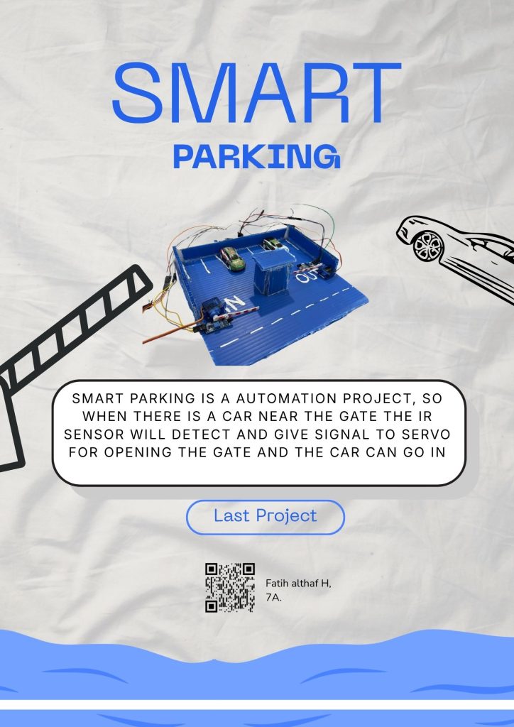
Smart parking

Smart parking

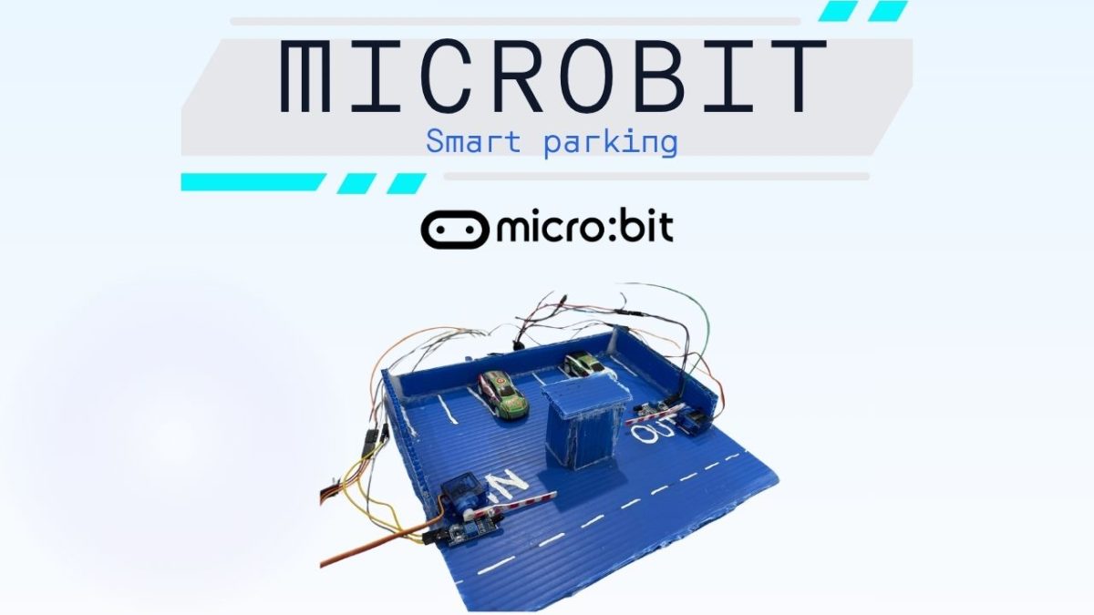
The last project from IT lesson at the second semester, that is Smart parking, in this project to we need to make a parking lot diorama from infraboard, this project need servo for the gate and IR sensor for the sensor if there is a car near the gate, with the signal from the IR sensor to the servo, with the signal servo will open or close the gate , when the gate is open than the car will be parked there and then if the car want to be out the system is the same like when the car want to go in.