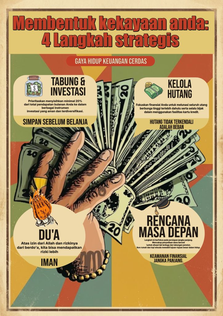
This infographic artwork was created entirely through digital illustration, combining a bold retro-poster aesthetic with structured infographic layout to communicate financial literacy content. The headline “Membentuk Kekayaan Anda: 4 Langkah Strategis” is presented in a thick, hand-drawn comic-style serif font with a red fill and dark outline, giving it a strong, attention-grabbing presence against the cream header background. Supporting labels and speech-bubble callouts use a mix of bold sans-serif headers and clean body text, keeping the four content sections easy to scan while maintaining visual consistency throughout the piece.
In terms of composition, this infographic is presented in a vertical portrait format with a central hand-drawn illustration of a hand fanning out cash as the unifying visual anchor. Four speech-bubble style callout panels are arranged symmetrically around this central image — two at the top for “Tabung & Investasi” and “Kelola Hutang,” and two at the bottom for “Du’a” and “Rencana Masa Depan” — each paired with a small supporting icon (a savings jar, a stack of bills, praying hands, a graduation cap) that reinforces its message at a glance. The radiating sunburst background pattern behind the central hand adds visual energy and draws the eye inward, while the vintage paper-textured border keeps the overall composition grounded and cohesive.
The color palette leans into a warm, retro tone with mustard yellow, olive green, burnt orange, and muted teal working together against a cream backdrop, creating a nostalgic, editorial feel that still reads as approachable and friendly. The consistent use of cream-colored speech bubbles across all four sections ties the composition together, while the red accent badge “Gaya Hidup Keuangan Cerdas” anchors the subtitle with a clear focal contrast point beneath the main title.
Technically, the difficulty level for producing an infographic like this falls into the intermediate-to-advanced range, as it requires careful balancing of illustrative elements, speech-bubble shape construction, and text hierarchy across four distinct information sections. Techniques such as custom shape building for the speech bubbles, integrating detailed hand-drawn illustrations, layering icons with text blocks, and maintaining color harmony across a busy retro background all come into play. This piece serves as a strong example of how illustration and infographic design principles can be combined to turn dense, informative content into a visually engaging and easily digestible piece of communication design.